
The most visually interesting, genuinely sophisticated British homes aren’t those with single-colour palettes or minimal patterns. They’re spaces layering multiple textures and patterns confidently—mixing smooth with rough, patterned with solid, shiny with matte. This layering creates visual depth, interest, and that indefinable quality we call “designed.”
Mastering texture and pattern layering elevates your entire home decoration. This guide reveals the techniques.
Understanding Texture
Texture refers to how surfaces feel—and how they visually appear to feel.
Texture types:
-
Soft: Velvet, silk, cashmere, soft wool
-
Rough: Linen, burlap, jute, raw wood, brick
-
Smooth: Polished wood, glass, ceramic, metal, leather
-
Nubby: Boucle, tweeds, ribbed fabrics
-
Matte: Cotton, linen, matte paint, unfinished wood
-
Reflective: Silk, satin, gloss paint, polished metals, glass
Spaces with varied textures feel more sophisticated and visually interesting than those with uniform texture.
The Psychology of Texture
Texture influences emotion and perception:
-
Soft textures: Feel welcoming, comfortable, intimate
-
Rough textures: Feel grounded, natural, authentic
-
Smooth textures: Feel sophisticated, contemporary, clean
-
Reflective textures: Feel luxurious, formal, special
-
Matte textures: Feel calming, understated, natural
Understanding these associations helps us see texture purposefully.
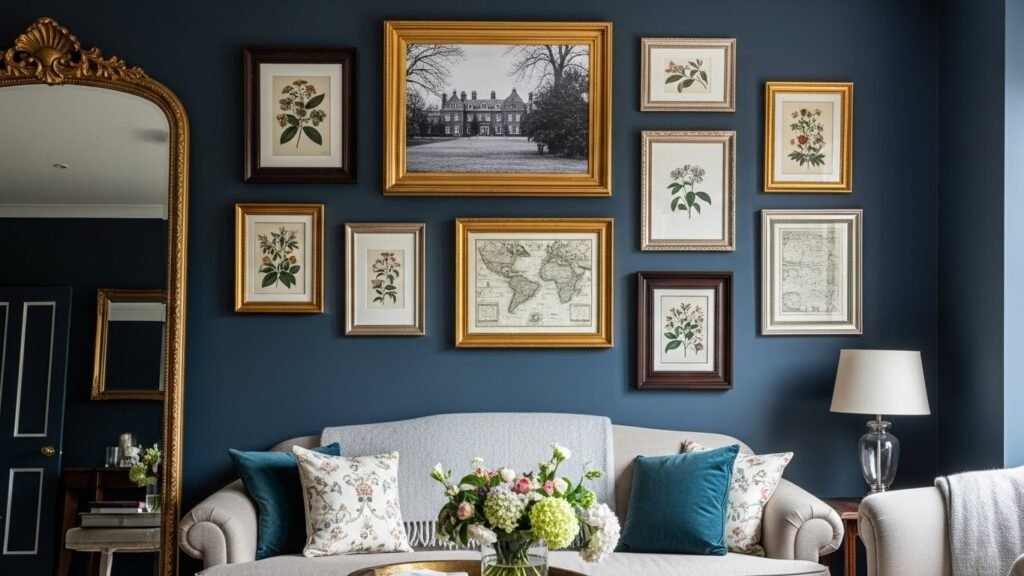
Layering Textures in Rooms
Successfully layered spaces combine multiple textures intentionally.
Texture layering in living rooms:
-
Smooth sofa + velvet cushions + linen throws + jute rug + polished wood table + matte walls creates a sophisticated variety
-
The various textures create visual interest without visual chaos
-
Each texture contributes to overall cohesion
Texture combinations that work:
-
Soft velvet with rough linen
-
Polished wood with natural fibre
-
Smooth leather with textured wool
-
Matte paint with reflective metals
-
Smooth ceramic with rough woven baskets
Understanding Pattern
Pattern refers to repeated design elements—not solid colours.
Pattern types:
-
Geometric: Structured shapes, mathematical regularity
-
Floral: Plant-inspired, organic forms
-
Abstract: Non-representational designs
-
Paisley: Traditional, ornate teardrop patterns
-
Stripes: Linear, structured, directional
-
Checks and plaids: Crossed lines, often traditional
-
Damask: Traditional, formal, ornate
-
Ethnic or global: Patterns from various cultures
Patterns convey mood and style. Choose patterns reflecting your aesthetic.
Pattern Scale and Proportion
Pattern size significantly impacts how patterns work together.
Pattern scale considerations:
-
Large-scale patterns: Command attention, work best on feature walls or single large pieces
-
Medium-scale patterns: Versatile, work with various other patterns
-
Small-scale patterns: Recede visually, combine well with larger patterns
-
Mix scales: Combining large and small-scale patterns creates interest without chaos
Mixing pattern scales prevents visual overwhelm.
Mixing Patterns: The Rules
Successfully mixing patterns requires understanding basic principles.
Pattern-mixing rules:
-
Shared colour: Patterns sharing at least one colour create cohesion, even when different styles
-
Vary scales: Mix large, medium, and small-scale patterns
-
Balance solids: Don’t pattern everything—solids provide visual rest
-
Complementary styles: Geometric + geometric, floral + floral often works better than geometric + ethnic across multiple pieces
-
Restraint: Limit to 2-3 patterns per room, typically
-
Proportions: Don’t make all patterned items the same size
-
Visual weight: Balance heavy patterns with lighter ones
These principles prevent chaotic pattern-mixing.
Practical Pattern-Mixing Examples
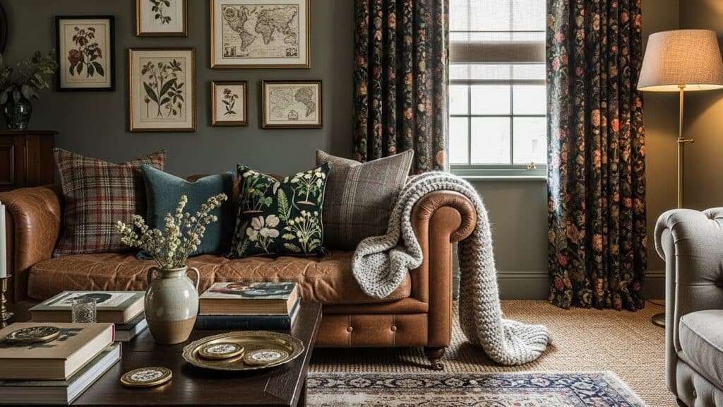
Living room example:
-
Patterned sofa: Large-scale geometric cushions
-
Patterned curtains: Botanical prisharesing accent colours with the sofa
-
Solid rug: Tying together colours
-
Patterned throw: Smaller-scale pattern complements others
-
Artwork: Solid frames or minimal patterns
Colours align despite different pattern styles—creating an intentional, designed look.
Bedroom example:
-
Patterned wallpaper: Subtle botanical on feature wall
-
Solid bedding: Coordinating colour to wallpaper
-
Patterned throw: Different style (geometric) sharing colour
-
Solid curtains: Complementing palette
-
Patterned rug: Small-scale supporting main patterns
Again, shared colours create cohesion despite pattern variety.
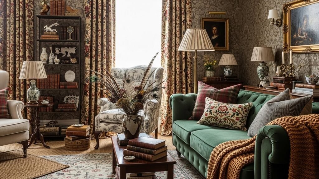
Texture and Pattern in Different Spaces
Living rooms:
-
High visual interest acceptable—spaces for gathering, entertaining
-
Multiple textures and patterns welcome
-
Dark, rich textures create cosy warmth
Bedrooms:
-
A more restrained approach is generally preferred
-
One patterned focus (wallpaper or bedding, typically)
-
Soft, soothing textures prioritised
Kitchens:
-
Practical considerations matter
-
Patterns often in textiles (tea towels, runners)
-
Easy-clean textures important
Bathrooms:
-
Water-resistant textures essential
-
Patterns are often subtle (personal space)
-
Spa-like textures prioritised (soft, luxurious)
Home offices:
-
Focus-supporting textures preferred
-
Minimal but intentional patterns
-
Professional appearance important
Creating Visual Interest Through Texture Without Pattern
Monochromatic or solid-colour spaces gain interest through texture alone.
Texture-based visual interest:
-
Varied finishes (matte paint, gloss furniture, reflective metals)
-
Multiple fabric textures (velvet, linen, wool, silk)
-
Natural materials at various scales (large wood beams, small woven baskets)
-
Varied surface finishes (smooth leather, rough hemp, polished wood)
This approach creates sophisticated spaces without pattern complexity.
Balancing Pattern and Texture
The most successful spaces balance both.
Balance formula:
-
50-70% solid colours and matte finishes (visual rest)
-
20-30% pattern (visual interest)
-
10-20% reflective/shiny textures (luxury and sparkle)
This ratio prevents overwhelming visual stimulation whilst maintaining interest.
Seasonal Texture and Pattern Changes
Updating textures and patterns seasonally refreshes spaces.
Seasonal approaches:
-
Spring: Light linens, botanical patterns, fresh colours
-
Summer: Bright colours, outdoor-inspired patterns, minimal heavy textures
-
Autumn: Heavier textures (wool, velvet), warm patterns, earthy colours
-
Winter: Maximum texture (faux fur, chunky knits), jewel-toned patterns, luxurious finishes
Seasonal updates keep homes feeling fresh throughout the year.
Where to Find Patterned Textiles
Pattern sources:
-
Etsy: Endless variety, independent makers, unique patterns
-
Department stores: Liberty (particularly known for patterns), John Lewis
-
Dunelm: Surprisingly good contemporary pattern selection
-
Independent fabric retailers: Specialist pattern selections
-
Vintage sources: eBay, charity shops, estate sales
-
Online retailers: Wayfair, Next Home, various specialists
Common Mistakes in Texture and Pattern
Avoiding mistakes:
-
Too many patterns: Overwhelming visual chaos (limit typically to 2-3)
-
No shared colour: Patterns with no colour connection feel chaotic
-
Scale imbalance: All large-scale or all small-scale patterns feel unbalanced
-
No solids for visual rest: All pattern exhausts the eye
-
Conflicting styles: Eclectic mixing without cohesion reads as accidental
-
Ignoring proportion: Tiny patterned element amid huge solid feels unbalanced
Awareness prevents these mistakes.
Conclusion
Sophisticated British interiors succeed through confident texture and pattern layering. This isn’t chaos or eclecticism—it’s intentional design creating visual richness and interest. Master the principles, understand scale and colour cohesion, and you’ll create spaces that feel genuinely designed rather than arbitrarily decorated. The key? Confidence. Choose patterns you love, layer textures boldly, maintain colour cohesion, and trust your aesthetic. The result will be spaces with genuine personality and visual depth.