
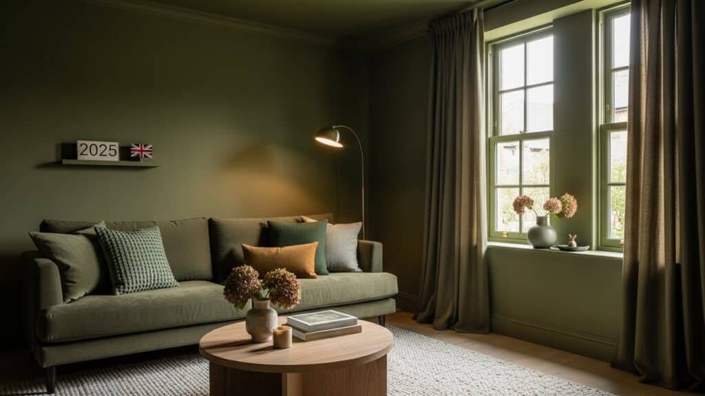
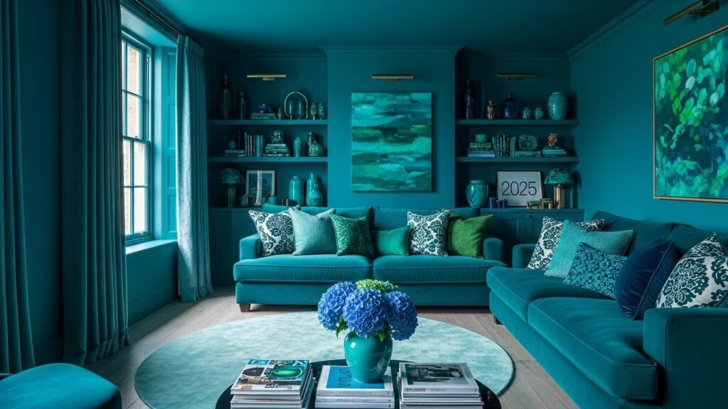
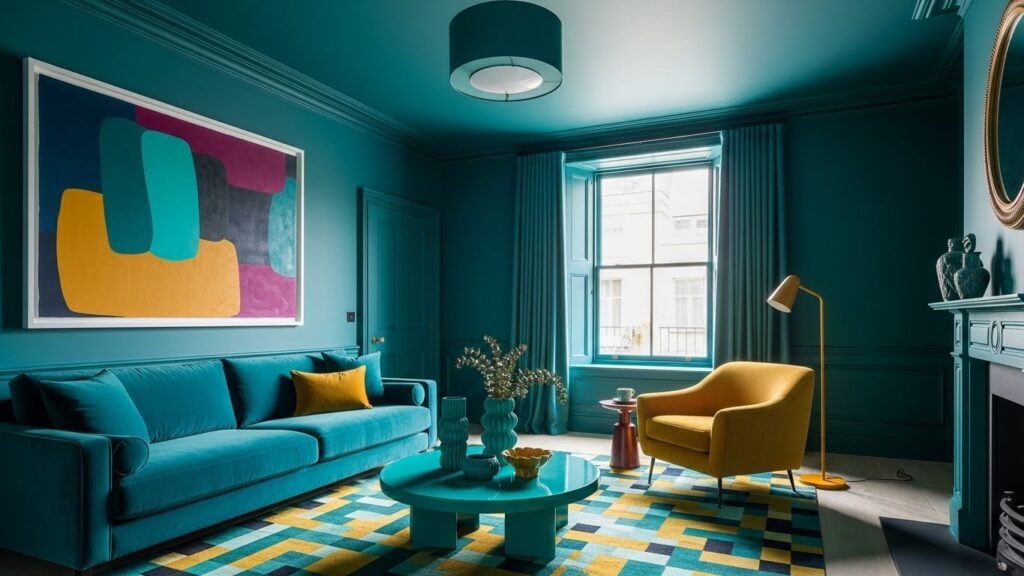
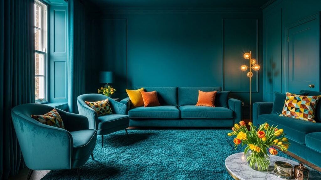
Colour drenching—painting walls, ceilings, skirting boards, and even radiators in the same rich colour—is the interior design trend dominating British homes in 2025. Unlike previous years’ timid neutral palettes, colour drenching embraces boldness, creating immersive, luxurious spaces.
This technique might seem intimidating, but executed thoughtfully, it transforms homes from ordinary to extraordinary. This guide shares exactly how to master colour drenching.
Understanding Colour Drenching
Colour drenching differs from traditional single-wall painting. Rather than restraint, it’s about commitment—covering entire rooms (including ceilings and trim) in coordinating colours.
Colour drenching principles:
-
Intentional boldness: Not accidental, but deliberate colour choice
-
Immersive environment: Surrounding yourself in colour
-
Psychological impact: Creates a specific mood or feeling
-
Depth and luxury: Makes spaces feel more sophisticated
-
Visual flow: Creates a sense of continuity throughout space
When executed properly, colour drenching creates genuinely luxurious, intentional spaces.
The Psychology of Colour Drenching
Colour powerfully influences mood and perception.
Colour drenching effects:
-
Deep jewel tones: Create intimacy, luxury, drama
-
Warm earth tones: Foster comfort, cosiness, welcome
-
Cool tones: Support calm focus (bedrooms, offices)
-
Dark colours: Appear to recede, making rooms feel deeper and larger
Understanding colour psychology helps choose drenching colours aligned with the space’s purpose.
Choosing Your Drenching Colour
Colour choice is the most critical decision.
Colour considerations:
-
Natural light: Rooms with abundant light can handle darker colours
-
Room size: Smaller rooms particularly benefit from colour
-
Purpose: Bedrooms suit calming colours; social spaces suit warmer tones
-
Personal preference: Your colour should genuinely excite you
Popular drenching colours for 2025:
-
Chocolate brown: Warm, luxurious, sophisticated
-
Deep emerald green: Nature-inspired, calming yet dramatic
-
Rich burgundy: Elegant, traditional, welcoming
-
Navy or charcoal: Contemporary, versatile, calming
-
Forest green: Sophisticated, grounding, distinctive
-
Deep teal: Jewel-like, contemporary, calming
Testing Your Colour
Before committing, test thoroughly.
Colour testing strategy:
-
Purchase test pots: An Inexpensive way to test colours
-
Paint large patches: Not just small swatches (colours change with scale)
-
Observe over time: View in morning, afternoon, and evening light
-
Consider artificial lighting: How does colour appear under your lamps?
-
Live with it: Spend days with the colour before committing
-
Get second opinions: Ask trusted friends’ input (though trust your instinct ultimately)
Proper testing prevents expensive colour mistakes.
Preparing Your Space
Successful colour drenching requires thorough preparation.
Preparation steps:
-
Clear furniture: Remove movable items
-
Protect fixtures: Cover light fixtures, outlets, and anything not being painted
-
Prepare surfaces: Clean, sand, and repair any damage
-
Prime walls: Essential for colour coverage (particularly for darker colours)
-
Quality paint: Invest in good paint—cheaper paint requires more coats
-
Gather tools: Quality brushes and rollers matter
Preparation determines finished quality.
Painting Technique for Colour Drenching
Proper technique ensures professional results.
Painting process:
-
Prime the entire room: Two coats if possible
-
Ceiling first: Paint the ceiling the same colour as the walls
-
Walls next: Paint in sections, maintaining wet edge for seamless finish
-
Trim last: Skirting boards, ceiling edges, anything being drenched
-
Multiple thin coats: Better than one thick coat (prevents drips, more even coverage)
-
Allow drying time: Between coats, follow paint instructions
Professional technique creates professional-looking results.
Coordinating Furnishings
Colour drenching requires thoughtful furniture coordination.
Furnishing considerations:
-
Light furniture: Balances dark walls (pale fabrics, light wood)
-
Metallic accents: Gold, brass, copper shine against dark backgrounds
-
Textural elements: Varied textures prevent visual flatness
-
Artwork: Light-coloured art often stands out against dark walls
-
Flooring: Often remains unchanged, providing a visual break from the wall colour
Furnishings should complement colour rather than compete with it.
Lighting in Colour-Drenched Spaces
Lighting becomes even more critical in colour-drenched rooms.
Lighting for colour-drenched spaces:
-
Abundant lighting: Dark colours absorb light, requiring adequate illumination
-
Multiple sources: A Single overhead light is insufficient
-
Warm-toned bulbs: 2700K creates a luxury feeling against dark colours
-
Dimmers: Essential for adjusting mood and brightness
-
Accent lighting: Highlight artwork or architectural features
Proper lighting prevents colour-drenched spaces from feeling gloomy.
Room-Specific Colour Drenching
Different rooms suit different drenching colours.
Bedroom drenching:
-
Moody jewel tones: Deep blues, purples, and teals promote sleep
-
Warm earth tones: Burgundy, chocolate brown create cosiness
-
Goal: Calming, intimate atmosphere
-
Furnishings: Light bedding balances dark walls
Living room drenching:
-
Warm tones: Burgundy, chocolate brown, encourage gathering
-
Jewel tones: Emerald, sapphire create sophisticated gathering spaces
-
Goal: Warm, welcoming gathering space
-
Furnishings: Light upholstery balances dark walls
Dining room drenching:
-
Rich jewel tones: Emerald, sapphire create an elegant dining
-
Burgundy or wine tones: Traditional, sophisticated
-
Goal: Create a distinctive dining experience
-
Furnishings: Light tablecloths, artwork stand out
Office/study drenching:
-
Calming cool tones: Navy, emerald support focus
-
Warm colours: Chocolate brown creates an inviting work environment
-
Goal: Support productivity and focus
-
Furnishings: Light desk surfaces, artwork for inspiration
Bathroom drenching:
-
Jewel tones: Emerald, sapphire, and navy create spa-like luxury
-
Deep greens: Nature-inspired, calming
-
Goal: Create a spa sanctuary feeling
-
Furnishings: Light towels, mirrors, lighting critical
Common Colour Drenching Mistakes
Avoiding mistakes ensures successful results.
Mistakes to avoid:
-
Insufficient testing: Committing without living with colour
-
Poor preparation: Skipping priming or prep creates uneven results
-
Insufficient lighting: Dark colours need adequate lighting
-
Ignoring lighting quality: Warm bulbs are essential; cold bulbs create a cold feeling
-
Neglecting furnishings: Dark walls require light furnishings
-
Entire home drenching: Reserve colour drenching for statement rooms
-
All dark colours: Unrelenting darkness becomes oppressive
Awareness prevents these common mistakes.
Alternative Colour Drenching Approaches
Full wall coverage isn’t the only option.
Variations on colour drenching:
-
Partial drenching: Paint walls and ceiling, but not trim
-
Single wall: Drenching one statement wall
-
Accent ceiling: Paint the ceiling in a drenching colour, keep the walls neutral
-
Ombré effect: Transition between colours
-
Two-colour drenching: Two coordinated colours in different areas
These variations offer colour-drenching benefits with less commitment.
Maintenance and Refreshing
Colour-drenched spaces require some maintenance.
Maintaining colour-drenched rooms:
-
Regular dusting: Prevents dust accumulation on dark surfaces
-
Touch-up paint: Keep extra paint for quick repairs
-
Careful wall washing: Clean gently to prevent damage
-
Annual review: Assess whether colour still excites you
-
Refreshing: Paint can be refreshed when it feels tired
Well-maintained colour drenching ages beautifully.
Budget Colour Drenching
Colour drenching needn’t be expensive:
-
Test pots are inexpensive: Test multiple colours affordably
-
Budget paint is adequate: Quality is important, but mid-range brands are sufficient
-
DIY application: Painting yourself saves a high cost
-
Focus on key rooms: Colour drenching one or two rooms is more achievable
-
Gradual approach: Drenching one room at a time is manageable financially
Colour drenching is achievable on realistic budgets.
Conclusion
Colour drenching represents a genuine shift in British interior design—moving from safe neutrals to intentional, bold colour. It’s not reckless or chaotic; it’s thoughtful, purposeful, and genuinely luxurious. When properly executed (through careful colour selection, thorough testing, proper lighting, and thoughtful furnishing), colour drenching transforms spaces into immersive, distinctive rooms. You’ll notice the difference immediately—in how the space feels, how guests respond, how it impacts your mood and experience. That’s the power of colour drenching: genuine transformation through bold choice. Try it. You might be surprised at how much you love it.